
 Chronicles
Poll Result: Entrance Rocks
Poll closed on July 18, 2025
Should We Spend $$ For New RSF Boulder Signage?
Member Comments
I have been asking this for years for there to be more branding for the neighborhood in our entrances. I am fine with the rock display but I wish we would invest more into proper landscaping and signage. When driving up Via De La Valle and turning left onto Via Santa Fe to go into town, there should be a big rock there and nice landscaping at the bottom of the slope of that house on the corner. I think a sign like "Encinitas" has in their downtown going from one street corner to the other would be great in the downtown area as you enter West to East on Paseo Delicias. Just my thoughts.
Bad idea.
Ive lived in SD since 1955 and the rocks at the ranch are milestones and memories stop trying to change for change sake has nothing to do with money
https://en.wikipedia.org/wiki/Coca-Cola
Some brands are timeless. Take Coca Cola as an example.
I too don’t have a talent for the poll question topic. A name for the restaurant might be nice. I want to click no opinions but I do “care”
Have u noticed that RSF has the worst maintained roads? They are terrible. Second would be to get rid of as much overhead power and data lines.
This is a classic sign and signage please keep it.
Living within the rocks is iconic and those who have lived here for some time know this.
As new residents of the Covenant, we like these markers which distinguish RSF from other communities in a significant and meaningful way.
these signs on a rock are "classics" and reflect the traditional values
that many of us want to maintain.
searching for a new choice would likely lead to some Berkeley/Madison Ave youthful
PR/Design type to dig (and bill) for something new and stylish - which is exactly
what we do not wish to have. thx for listening. drw
I feel that being “Historic“ the original branding should be preserved and not changed; it’s part of embracing the blessings that RSF holds. However I can’t help notice that the font is slightly different and feel from a marketing standpoint consistency is important to uphold. Also any changes to a historic site probably and should involve approval from the Federal Registry.
Upgrade to be in sync with new branding for restaurant etc.
I would not spend a lot of dough on this but if reasonable why not a fresh look.
Olivenhain have a boulder with MUCH more attractive lettering and color and the effect is very nice.
Something awesome, but classy, somewhere in between a small dirty rock and the Arc de Triomphe.
Suggest that we focus on reducing speeds and placing 4 way stop signs at dangerous intersections such as Linea de Cielo and El Camino Real. It is so dangerous, especially for our teens driving to Torrey Pines High School.
Our RSF roads have turned into a speedway with loud speeding cars that jeopardize the safety of people, equestrians, wildlife and other drivers.
Keep something historic - so much is changing
I love the idea of the new bar / restaurant having a branding / a theme / a vibe that ties in with historical RSF. The Crosby and Fairbanks have done this with their names. The RSF Inn has done it also. Great idea!!!!
My opinion is that the signage and rock are iconic, however if it actually looked as lovely as the picture it would be nice. Most of the signage does not have beautiful flowers or nice landscaping. I realize how precious water is but used at our entrance signage it is worth the cost. When we moved here in 1998, the flowers and blooms surrounded the entry points and signage to the Ranch as well as in the village and on Acacias where the golf course splits.
It's not about saving money. It looks good. It's quaint and quiet and we are NOT Carmel Valley nouveau riche. It's lovely. Let it be.
Leave them alone. They are an original part of our community and survived all these years. We need historical value.
The boldest are nicely understated.
I would hate to see us move to flashy new signs.
What would really be nice is to have lower speed limits or even some enforcement of the existing limits.
Just walk along La Granada and you will see lots of street racing.
Replace the word “Historic”.
Modernize the text.
Work on a logo.
Rancho Santa Fe has a look and feel like no other community in the greater San Diego area. A better branding and signage exercise would benefit all. Keep it rustic and classic. I think we could all squeeze an extra dollar or two from our wallets to support better identity for our community. Great idea Phil!
Are they just looking to waste money?
A bit of a throwback, which is nice and in keeping with our community.
Looks kind of dated.
I don’t understand why we need to hire outside branding team when we have talented individuals within the community who offer to help with numerous things & the board/art jury reject their help.
Some could use a little cleaning up.
We should focus on truly important issues.
I sometimes think "Pre-Historic" Rancho Santa Fe might be more fitting.
Harvest Market Center has done a wonderful job rebranding as THE RANCH. Very refreshing, crisp and clean …Kudos to the owners
Perhaps all of our signs could contain the sameness tie back just like THE RANCH has
Joemize
I love our rocks. I’ve lived here my entire life and I will be extremely sad to have these changed. Its part of our history.
The existing signage is more than fine… it’s charming and traditional.
Dump the “Historic”. Most outsiders think that we think we are better than them and addition of the modifier just confirms it. Every city is “historic” for one reason or another. It just makes us look like pompous twits. Of course, maybe we are pompous twits, but after living here for 30 years, i have found that the true Ranch folks are pretty down to earth.
JE
My opinion is that the entry rocks are perfect the way they are. Low-key and unassuming! Let’s keep it that way….
The existing signage is understated and appropriate - do we need to advertise? There's a reason that we don't live in one of the other RSF communities.
And maybe include "Covenant"
I see no need to brand the restaurant either. Let’s stop spending money on frivolous projects.
Love the rocks! They are understated, classy, and subtle. I'd love to see the actual Osuna Brand be part of our new imaging. I would love to see it on shirts, license plates, car stickers and more.
May want to also look at the logo too. I am a member of another golf club with a 100 year history in Monterey with a storied past and is recognized as one of the best clubs in the country. A bit over ten years ago, the club hired a NY marketing firm to rebrand the club including its 90 year old logo. This was very controversial move by the board not only because of the significant cost (7 figures) but legacy members convulsed at the thought of abandoning the traditional pine branch and cone logo for something new and different. Once it was unveiled it was met with a lot of negativity by the older members but in time it has become an endeared and nationally recognized logo in the golf world. It was also the beginning of a renaissance of sorts for the club as it transitions from the old guard to a more vibrant membership. This may sound familiar. Change is good but can be difficult for the old soul.
Honestly a branding firm— what a waste of money
RSF has become one of the best communities to live in without rebranding.
Too many people don’t have enough to do if rebranding the restaurant, changing the font on the rocks and redecorating the restaurant are their primary concerns Don’t spend our HOA money on things we can live without.
The term “inside the stones’ is how living in the covenant is distinctive from just being in Rancho Santa Fe. Please don’t advocate for a change
I like the old school look! Thank you for asking - I agree with many of your suggestions about branding and revitalizing.
We don't need to completely re-create the signs but, I think the signs/font/style of the markers should all be the same. Pick one of the existing signs and make sure all the others look the same.
Keep the boulders and consider incorporating the presumably new font developed by the agency onto the boulders
Any branding company worth their salt should do that for the original price of what they quoted to do all the other work
need to be more prominent. As a new resident i can’t say i have ever seen them - at least consciously
SOLANA beach has really nice entrance signage.
In my opinion RSF should be subtle and understated. The simple old rocks do a fine job. Opinion of one.
Branding for a private golf club restaurant? Why?
Total Voters: 110
Poll Preamble
All major roads leading to the Rancho Santa Fe Covenant are marked with a sign on large boulders that read "Historic Rancho Santa Fe".
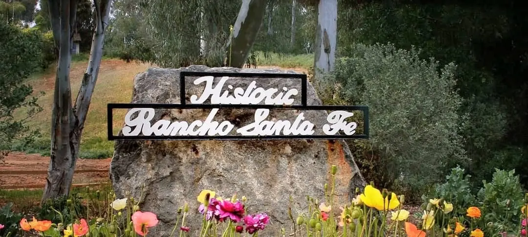
RSFA is engaging a branding firm to give our clubhouse restaurant a name and also to design new entrance signs into the recreation campus. So, this could be a good time to also look at these RSF neighborhood signs.
But is it worth it? Are the existing signs fine and worth keeping? Do we want to spend the time and money for this project? What do you think?